Color does more than make a website, brand, or marketing piece look beautiful—it influences how people feel, think, and respond. This concept is known as color psychology, the study of how colors can affect emotions, perceptions, and decision-making.
Whether you’re creating a website, building a brand identity, designing marketing materials, or planning social media content, color choices play an important role in the experience you create for your audience.
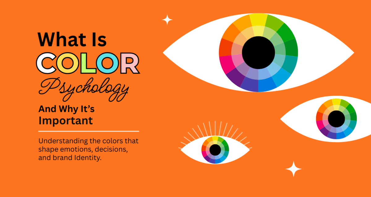
What Is Color Psychology?
Color psychology explores the connection between colors and human behavior. Different colors are often associated with certain emotions and messages. While experiences and cultural influences can shape individual reactions, color still has a strong impact on first impressions and engagement.
For example:
Red
Orange
Yellow
Green
Blue
Purple
Black
White
These emotional connections are why color becomes such a powerful design tool.
Why Color Psychology Matters
1. Creates Strong First Impressions
People often form opinions within seconds of seeing a brand or website. Color immediately communicates mood and personality before visitors read a single word.
A modern, minimalist business may use neutral tones, while a playful creative brand might lean toward brighter palettes.
2. Builds Brand Recognition
Consistent color use helps audiences recognize and remember your brand. Over time, your color palette becomes part of your identity and creates familiarity across websites, social media, and print materials.
3. Influences Customer Decisions
Colors can guide attention and encourage action. Strategic use of contrast can make buttons stand out, highlight important information, and improve overall user experience.
4. Supports Your Brand Message
Every brand tells a story. Color helps reinforce that message visually.
For example:
- A wellness brand may choose soft greens and neutrals.
- A luxury service may favor black, gold, or deep jewel tones.
- A creative studio may combine bold colors with clean layouts.
How to Choose Colors for Your Brand
When selecting a color palette, ask yourself:
- What emotions do I want my audience to feel?
- Who is my target audience?
- Does the color reflect my brand personality?
- Will it work consistently across website, social media, and print?
A helpful approach is choosing:
- 1 Primary Color – Your core brand identity
- 2–3 Supporting Colors – Add flexibility and depth
- 1 Accent Color – Draw attention to calls-to-action
Color psychology isn’t about following strict rules—it’s about creating intentional experiences. The right color choices can strengthen your message, improve recognition, and help visitors connect with your brand more quickly.
When used thoughtfully, color becomes more than decoration—it becomes a communication tool.